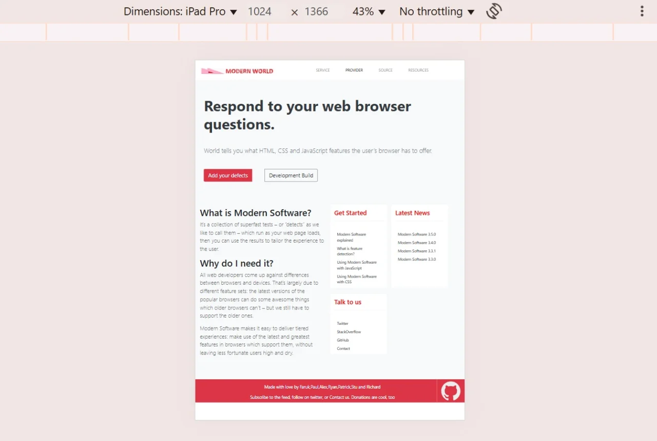
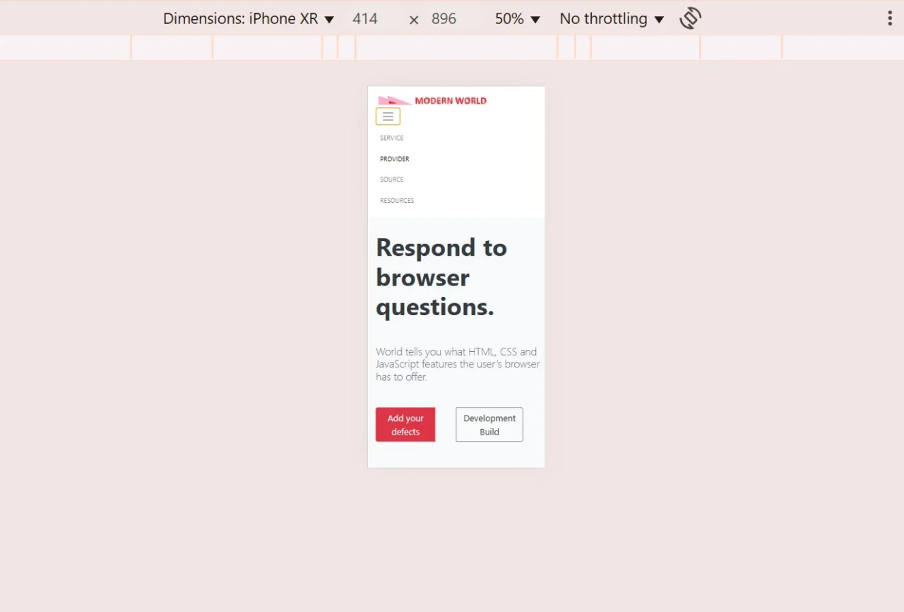
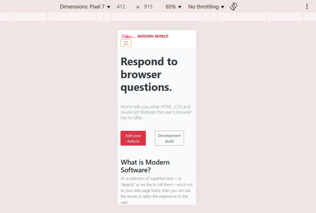
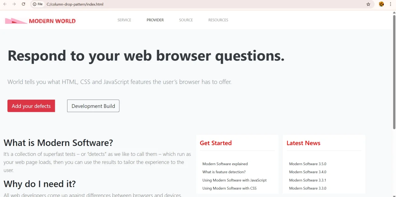
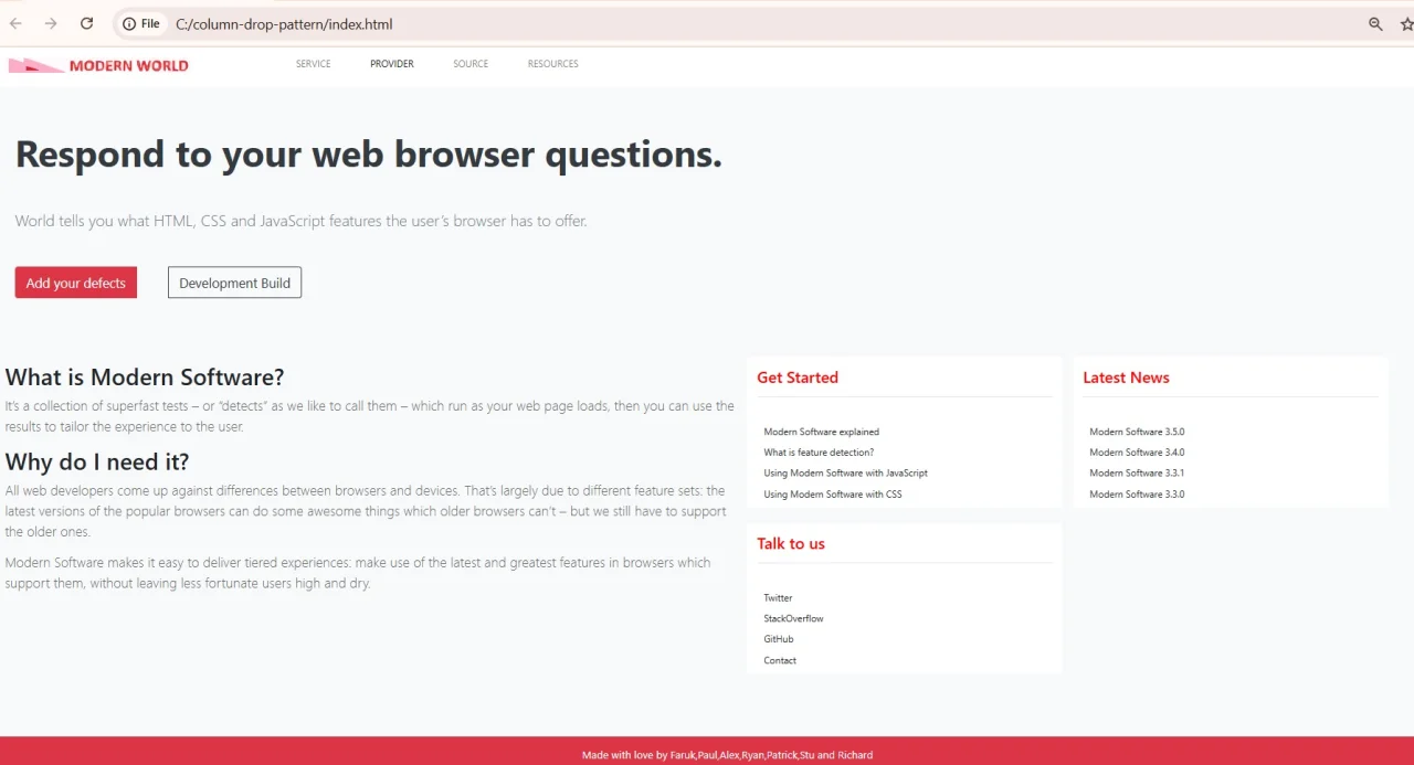
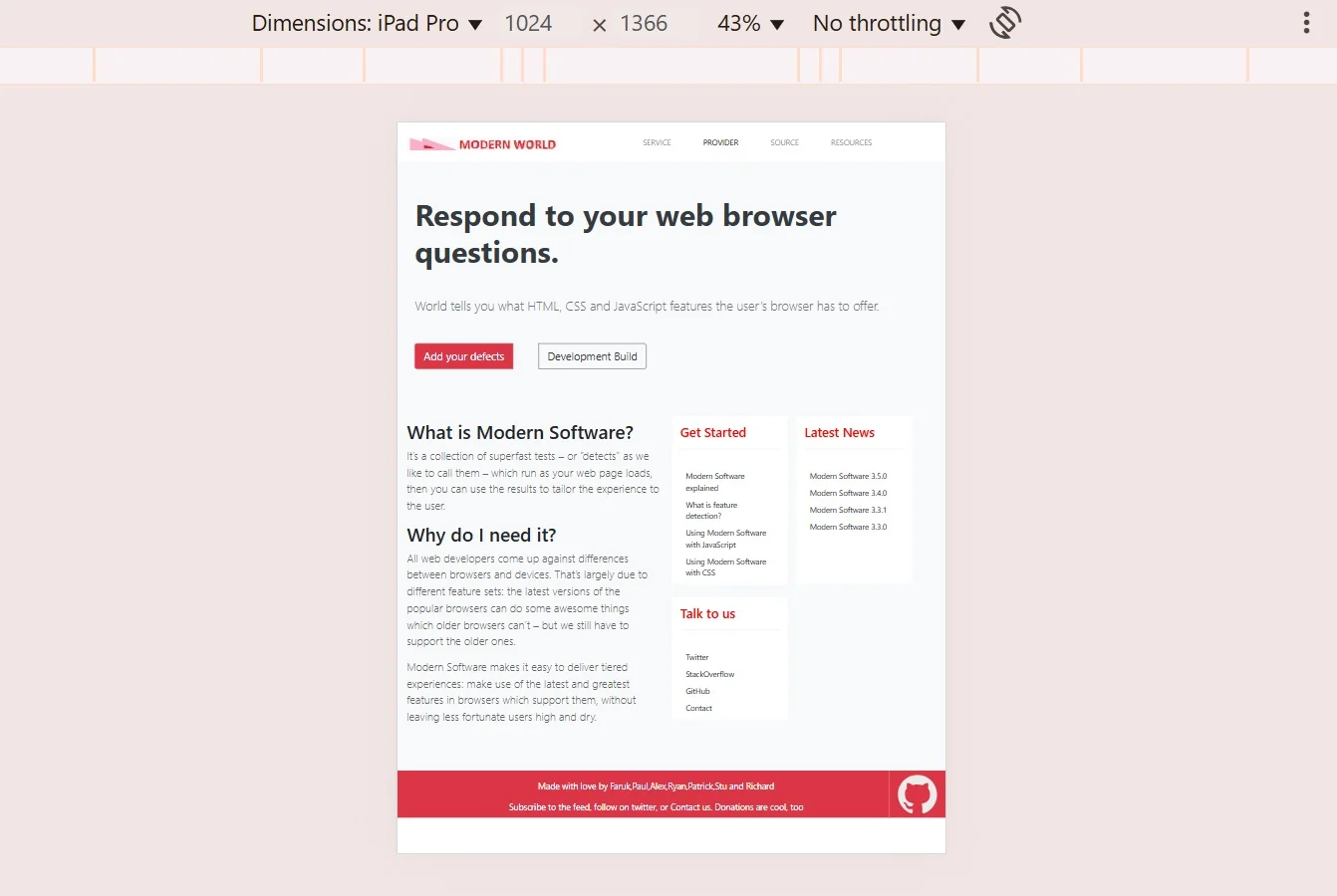
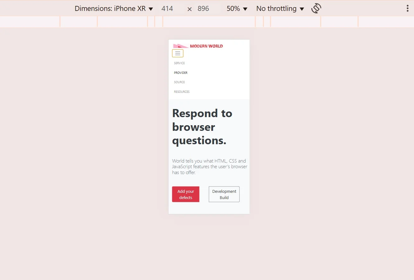
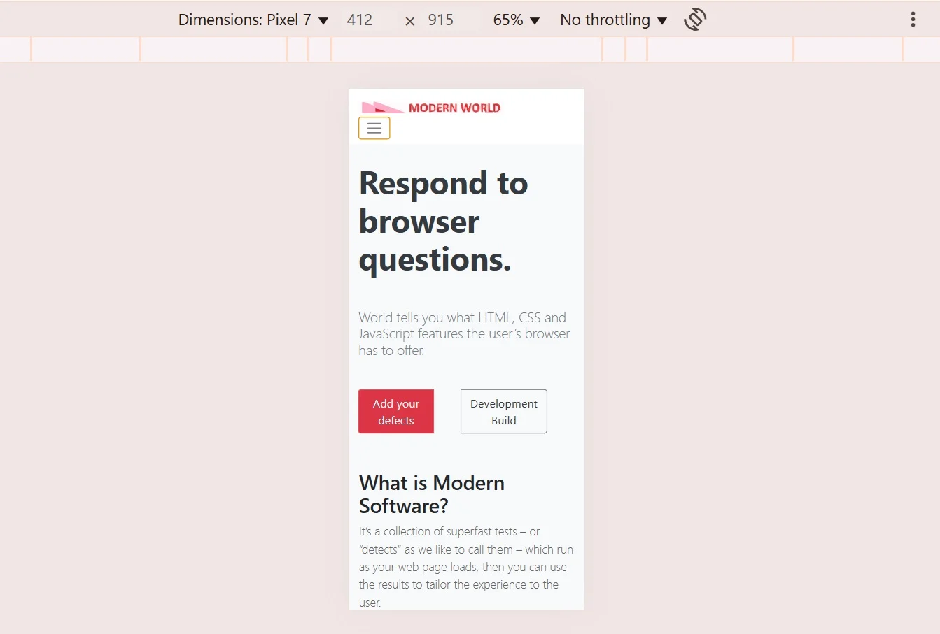
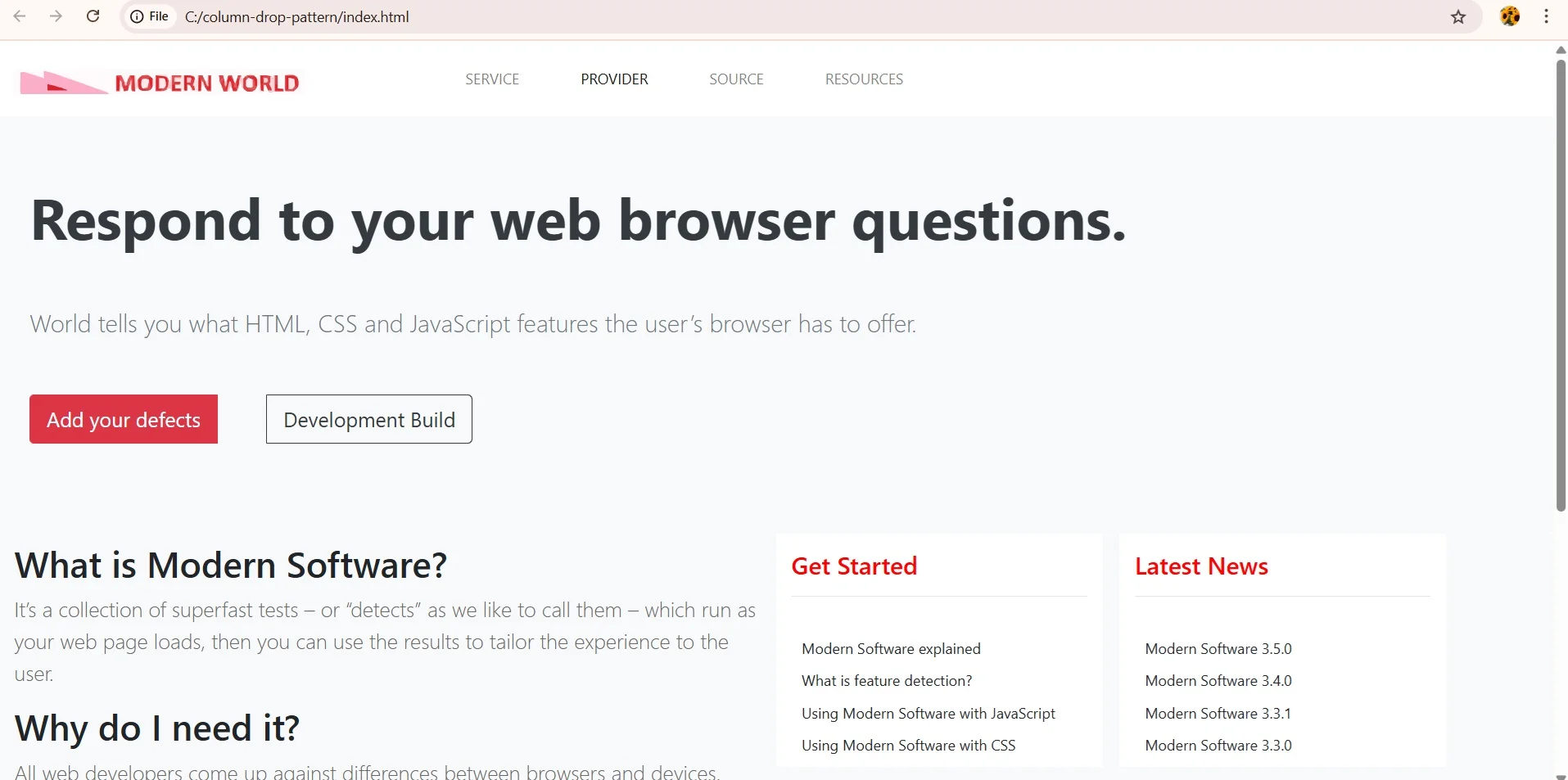
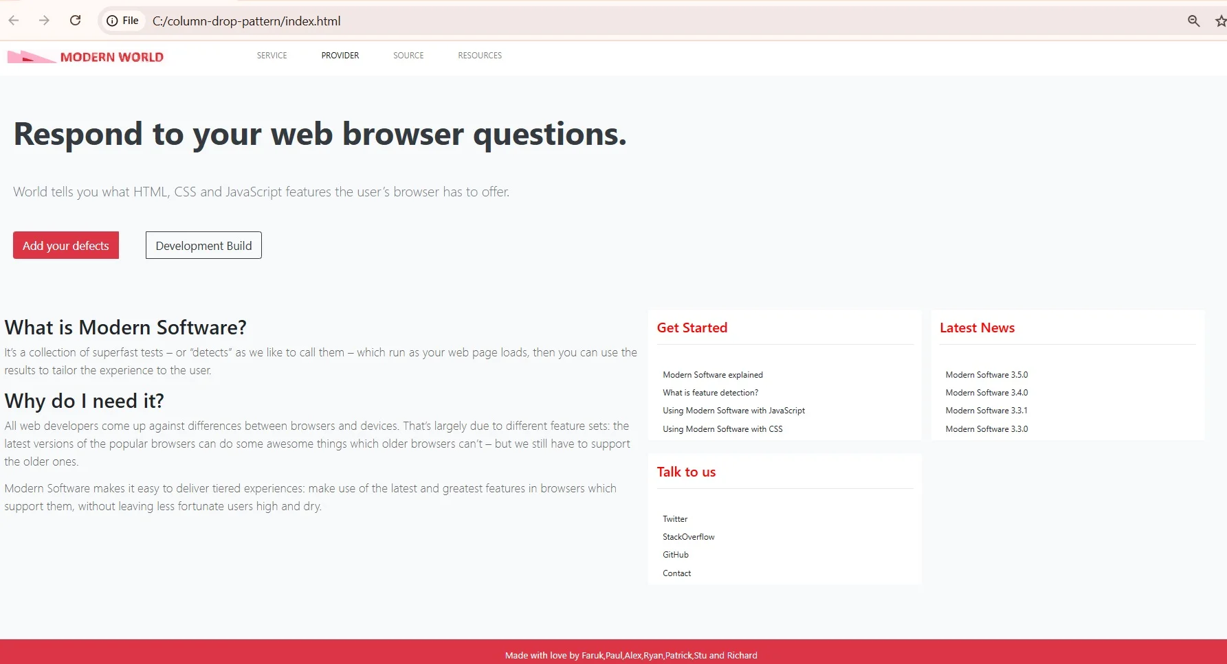


Webpage - Desktop and Mobile View
Responsive Design patterns are used to make a web page responsive across various devices of varying screen sizes.Most design patterns will use breakpoints to adapt for different…
Item Description
Responsive Design patterns are used to make a web page responsive across various devices of varying screen sizes.Most design patterns will use breakpoints to adapt for different screen sizes. A Breakpoint is the point at which a different CSS will be applied, usually through a media query, to optimize the design for the user's viewport. A good example of a breakpoint would be one where your layout has to change from two columns to four columns from one device to another.
Features
Created a Web Page for Column drop pattern using Bootstrap framework.
$ 7
- Verified source code
- Join 35189+ buyers which trust us!
- Download code immediately

100% Guarantee For Item!
Satisfaction guarantee policy.
Satisfaction guarantee policy.
Information
| Category | Scripts & Code / CSS |
| First Release | 7 April 2025 |
| Files included | .html, .css, .cs, .c |
| Framework HTML/CSS | Bootstrap |
| File Size | 1 MB |
| Frameworks | CSS |
Similar Items